Marketing Observations from My Summer Vacation, 2016 Edition
My family moved a few months ago, so we had to wait until we had a deal in place to sell our house to book a vacation. Because options were limited, we decided to go back to the exact same beachfront condo as last year in beautiful Wildwood, NJ.
There’s something to be said for the known quantity. My wife, Kelly, and I didn’t feel like searching for a new place. We knew this condo was perfect for us. We knew the area and attractions well enough to make the most of our time and save a few bucks.
Most importantly, our daughters, 6-year-old Caitlin and 3-year-old Cassidy, loved Wildwood and loved staying in this condo last year.
But because we went to many of the exact same places, I was worried that I might not be able to come up with enough marketing and customer experience observations, which are directly related, to fill a blog post.
Fortunately, that wasn’t the case. Let’s get started.
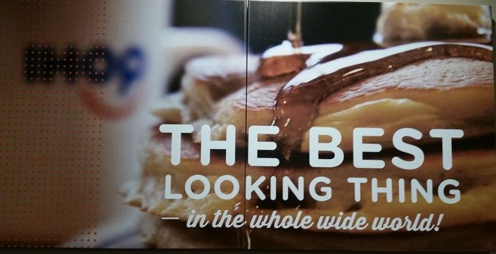
Kelly and I love to introduce the girls to cuisine from different cultures, so we were very fortunate to stumble upon the International House of Pancakes during a potty break on the way to Wildwood. But something about this sign bugged me. I’m not sure if it was the text covering the pancakes or the fuzzy IHOP logo or the red dots and smileys, but this sign was definitely not the best looking thing in the whole wide world.
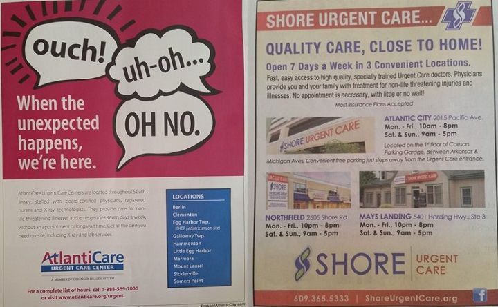
These two ads appeared in the same publication in our condo. As someone who once had to use urgent care while on vacation, the one on the left is definitely more relatable. Nobody expects to get hurt on vacation. The one on the right seems more than a little cliché, and photos of the buildings seem irrelevant. Also, “close to home” doesn’t apply. I, like the vast majority of readers, was on vacation.

Is it just me, or does that banner going across the golfer’s arms look like crime scene tape? By the way, that $20 coupon is only valid at one of the three golf courses being advertised. Too many restrictions and too much fine print for a simple discount.

This golf course gets it. Simple offer. No fine print. Good use of a landmark so people can visualize the location. Most importantly, this golf course embraces what it is – an inexpensive course for people who don’t treat every stroke like life and death. Too many courses try to be Augusta when they’re closer to pitch-and-putt.
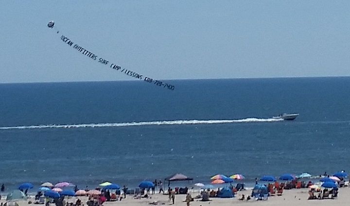
In last year’s post of marketing observations from my summer vacation , I said the following about aerial advertising:
I’ve seen planes pulling banners as far back as I can remember as a kid growing up at the Jersey Shore. However, I never saw a banner ad pulled by a boat until my 2015 summer vacation. I guess that’s a cheaper, less effective alternative to aerial advertising when it comes to reaching people on the beach.
Calling it “less effective” was probably a bit harsh and shortsighted. Actually, a guy who offers that type of advertising called me after reading the post and told me I was wrong.
After reviewing last year’s post, I noticed that the advertiser in last year’s photo is the same as in this year’s photo. Clearly, they wouldn’t keep doing this type of advertising if it didn’t work. I stand corrected.
Also, my wife noticed that Domino’s was using a banner pulled by a boat to advertise pizza delivery to the beach. If they could throw in a couple cocktails with the pizza, that would be my own personal utopia.
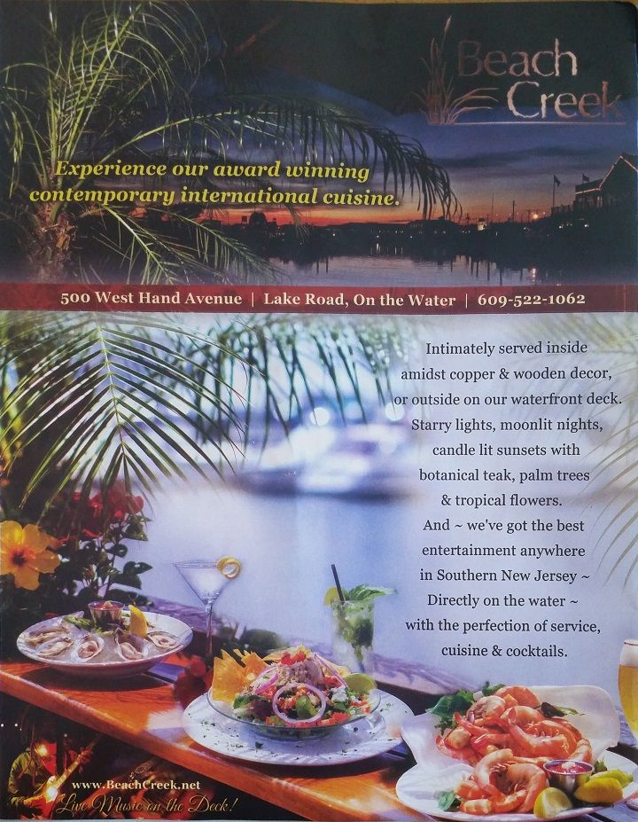
My family had dinner here once before and decided to try it again. I’m no restaurant reviewer, so I’ll keep it simple. The food was good, not great. Nobody came to take our order when we first sat down. When the waitress finally arrived, she clearly wasn’t happy about it. Once she got over that, the service was perfectly fine.
I’d give the overall experience 3.5 out of 5 stars. We would go back.
As for the marketing, it doesn’t do the restaurant justice. I appreciate the attempt at using content to sell the atmosphere and paint a picture. But why not just show actual, close-up photos instead of a distant, outdoor shot that resembles a stock photo?
Show the atmosphere, which is outstanding, in photos. Use the content, along with imagery, to sell the food, which will ultimately determine if people will go back.
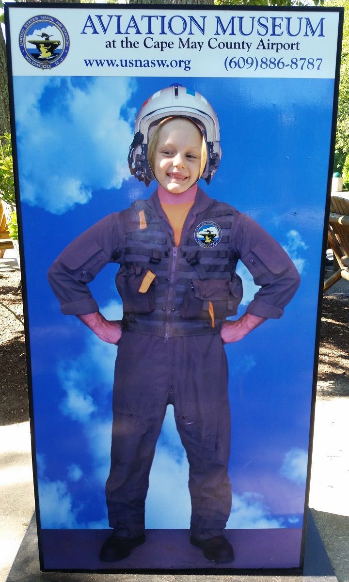
I have to say, I was pretty impressed with the Cape May County Zoo in terms of marketing and customer experience. I don’t know why any place geared towards kids wouldn’t have displays like this that allow kids to stick their faces through a hole and have their picture taken.
Kids love them. Parents love them. And we share the photos all over the place. It’s easy, organic marketing. This particular photo op, one of many at the zoo, is also a cross-promotional tool with the local aviation museum. Well-played, zoo people.
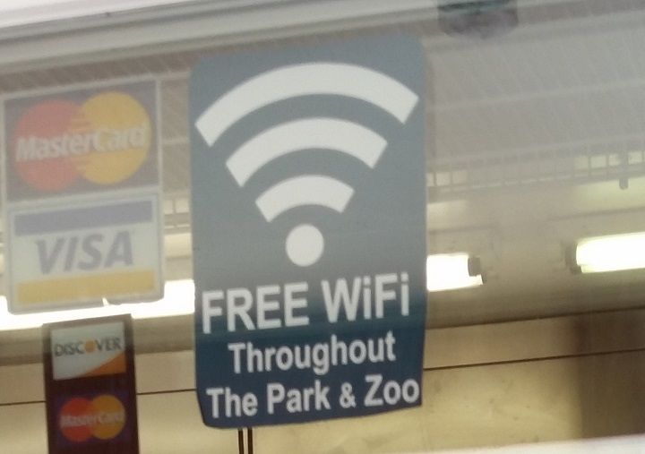
This sign appeared at the zoo café. I’m no IT expert, but as someone who writes 15-20 blog posts per month for IT service providers, I’ve acquired enough knowledge to know that offering Wi-Fi in an outdoor venue, especially one as massive as a zoo, is a complex undertaking. Good for the zoo people for recognizing that Wi-Fi is now an expectation and no longer a “nice to have” convenience.

Amusement parks are notorious for putting signs like these all over the place. I would suspect that people trip over them more than they read them.
I equate these signs with online pop-up and pre-roll ads. They get in the way and disrupt the customer experience. I love the Wildwood boardwalk, but these signs need to be kept to a minimum and removed from high traffic areas.

Notice the ride attendant clapping as the kids pass by on the train. Ride attendants also smiled constantly, clapped at the end of each ride, and high-fived the kids as they exited through the ride gate. I’ve never seen anything like it at an amusement park.
More often than not, ride attendants are young people who are collecting a summer paycheck and counting the minutes until they can leave. These ride attendants were clearly screened and trained to make the experience as enjoyable for the kids as possible. Hats off to Morey’s Piers management and ride attendants. Mission accomplished.
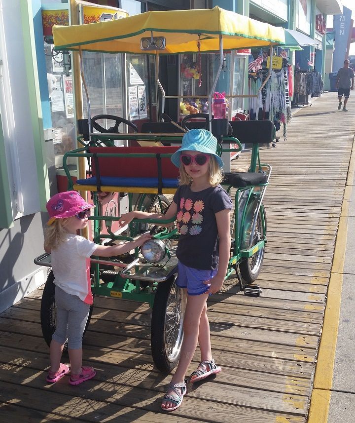
Kelly and I took the girls for a ride on a bike with two bench seats. When Kelly called to find out about pricing and hours of operation, the people who answered seemed annoyed, as if they always have to answer these questions.
Great people in person, but they didn’t exactly make a positive first impression. Here’s a simple solution – put that information on your website!
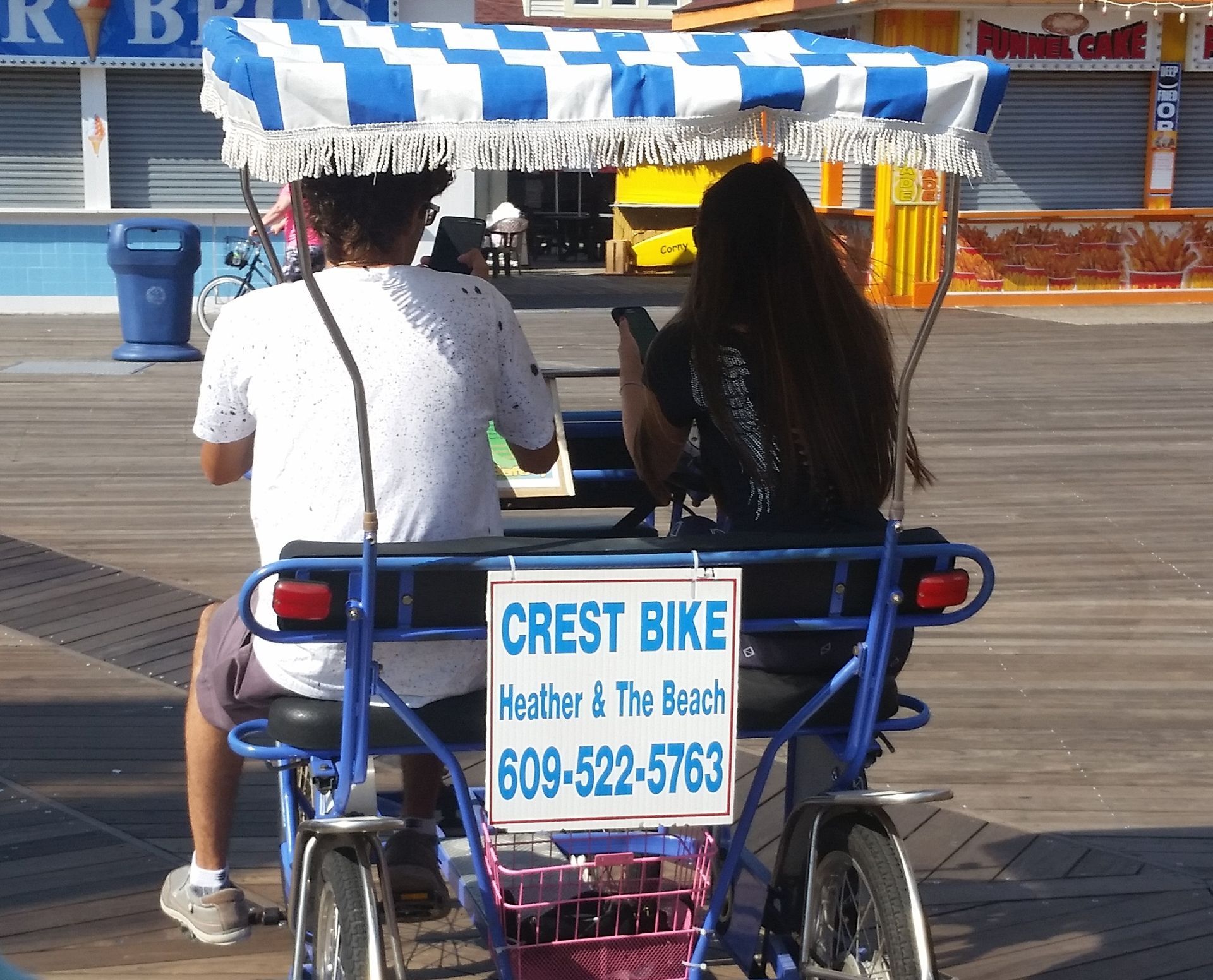
Let me close with proof that we’re all going to hell. These two rented a bench-seat bike just like we did, but decided to spend a beautiful morning on the boardwalk with their eyes glued to their smartphones as they pedaled. Perhaps they were searching for Pokemon.
On an unrelated note, after I published last year’s post of observations from my summer vacation, I got an email from the marketing director of a local amusement park. She said she loved the post and asked if I would be willing to share my observations of her venue if she provided me with passes for my family. And paid me.
After about two seconds, I agreed.
Two takeaways here. First, if any other amusement park executive would like me to do the same for their park, it wouldn’t take much arm twisting. In fact, I’d love to make it a career. Second, blogging works!
Now it’s time to start thinking about our 2017 summer vacation…
